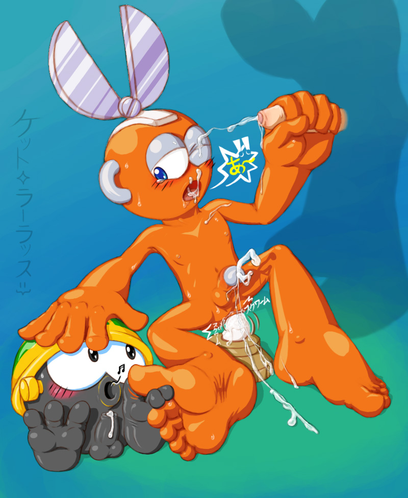
This started out as a practice session, but due to the complex nature of it, and a few added variables, it turned into a full-blown art piece. One that I'm rather proud of, I should mention.
The practice session, titled "Nihon" (the Japanese name for Japan), was intended to determine the common elements present across Japanese-drawn porn (specifically, the stuff I enjoy), and replicate them in a work of my own. Back on the night of the 16th, I gathered about a dozen of my favorite pictures drawn by (to the best of my knowledge and research) real Japanese artists. I tried to get an actual variety of artists; I'm sure I referenced at least six distinctly different people. I analyzed the pictures to extract the common elements and made a list of them here:
1. Always blushing. Red area vertically between cheeks and eyes, often as separate ellipses centered on the outside corner of each eye, but sometimes connected across to form a single unit. Black diagonal slashes across the blush that are always in the same direction (typically bottom-left to top-right) and sometimes "floating" above the face.
2. Large eyes with expressive eyebrows/eyelids and an expressive mouth that convey a shocked, embarrassed, or otherwise awkward mood. Rarely seems to display a mood of general contentment, pleasure, or mirth.
3. Tears. Over half of the pictures feature characters with ellipses of tear fluid positioned at the outside lower corners of the eyes. Some of these feature a stream of tear fluid leaking from that area.
4. Sweat drops typically in the range of 0~6 per character (even on furry characters) dripping down the length of 0~1x the size of the drop. Tiny drops of fluid in random places, but always at least one of them the head. They are sometimes represented solely as white spots, and sometimes drip down much more than usual.
5. Fluids fucking everywhere. The mouth drips saliva, the cock is laced with saliva/pre-cum/lube/whatever (this can be shown in a variety of ways), the dick drips and flings cum, a cum shot appears out of nowhere to cover the character, his face, or an orifice. Anything goes. The key is making each type of fluid look distinct.
6. Thin lines. Even at their thickest, the inked lines are still thinner than what I typically draw.
7. Distinctly separate color shades are popular, but not a standard.
8. Often has an obscured frenulum or tip of penis, sometimes with a small dark censor bar. Generally, any point of ejaculation or penetration is censored this way as well.
9. Random Japanese text and expression lines all over the place. The text usually represents dialog or sounds that occur in the picture.
Drawing Order: 2,6,7,1,3,4,5,8,9
I referenced this list while creating my own picture, started on the night of the 17th and completed now. I was tempted to make things easier by using a smaller, more animalistic character similar to most of the pictures I referenced, but that can be done in a future installment. Cutman, the first Robot Master following Blues/Rock/Roll, is the subject I decided upon going into this, and that's who I drew.
I had a little help from a <a href="http://www.amazon.com/Mega-Articulated-Action-Figure-Cutman/dp/B000IMLHEI">physical 3D reference</a>, but realistically it played a very minor role in how I posed my character. For one thing, it has slightly bigger proportions than the official art I was referencing, and it's not flexible enough to exactly emulate the pose I wanted. However, I did use it to make sure my own pose was feasible and not complete bullshit.
Although I may work ridiculously slow, the constant redrawing and tweaking of parts eventually pays off. It now seems that I'm a lot more proactive at correcting stuff that looks like crap, rather than playing it off as the limit of my abilities and letting it stay as a blight on my work. I also believe all of the practice thus far has payed off already, since I have referenced some past experiences here (such as the eyes, to give one example).
I tried to stick to the official art as closely as possible while taking my own liberties with making Cutman butt-naked. This adherence includes the "tri-shade" color scheme. Of course, I decided to make my lines dark-orange rather than black to give the whole thing a softer feel. On an added note, I tried making the soles of Cutman's feet a lighter color, but it didn't look right.
I probably could have finished this picture a week sooner, but I decided to add in a couple enemies, and I think this makes a better picture overall. Squirms technically didn't appear until Mega Man 2, but the idea randomly popped into my head, and it fits so perfectly that I just couldn't let it go to waste. I originally had an E Tank in place of the Met, but I wanted someone to interact with Cutman's foot, and Mets are too adorable to exclude. Also, I was able to use the Met to do a few artistic things that Cutman is too human-like to use.
I was going to make a version with censor bars, but I thought nah forget it, "yo homes, to Bel-Air!" While that would have added to the Japanese authenticity factor, the main point of this picture was to practice drawing the things I like, and censorship is very much on my shit list. Other things I considered doing were adding more fluids and smoothing the color highlights, but the cost in time would greatly outweigh the payoff.
Overall, this was a very fun project to work on. This style is a bit different than what I'm used to, but it looks great, so I may incorporate elements of this into my typical works. After I completed my initial objectives, I kept layering on effects, fluids, and other forms of detail until I was satisfied, and that seemed to work just fine. I slacked off a bit in the past week, but I pulled through when I needed to get this done.
Ah, this is an impressive amount of study you put into your work. Well, I am a bit of a sucker for the Mega Man Powered Up versions of the robot masters, so that sways my opinion pretty heavily.
Hey, thank you! While I prefer to draw characters close to their original reference, I often take heavy liberties with removal of clothing and armor and such, so it may not be up every Robot-Master-phile's alley. I was actually going off the official art from the original series with this, but if you felt I channeled the Powered Up style here, that means I succeeded at making it somewhat "cute". =}
Comments
<!--more-->
This started out as a practice session, but due to the complex nature of it, and a few added variables, it turned into a full-blown art piece. One that I'm rather proud of, I should mention.
The practice session, titled "Nihon" (the Japanese name for Japan), was intended to determine the common elements present across Japanese-drawn porn (specifically, the stuff I enjoy), and replicate them in a work of my own. Back on the night of the 16th, I gathered about a dozen of my favorite pictures drawn by (to the best of my knowledge and research) real Japanese artists. I tried to get an actual variety of artists; I'm sure I referenced at least six distinctly different people. I analyzed the pictures to extract the common elements and made a list of them here:
1. Always blushing. Red area vertically between cheeks and eyes, often as separate ellipses centered on the outside corner of each eye, but sometimes connected across to form a single unit. Black diagonal slashes across the blush that are always in the same direction (typically bottom-left to top-right) and sometimes "floating" above the face.
2. Large eyes with expressive eyebrows/eyelids and an expressive mouth that convey a shocked, embarrassed, or otherwise awkward mood. Rarely seems to display a mood of general contentment, pleasure, or mirth.
3. Tears. Over half of the pictures feature characters with ellipses of tear fluid positioned at the outside lower corners of the eyes. Some of these feature a stream of tear fluid leaking from that area.
4. Sweat drops typically in the range of 0~6 per character (even on furry characters) dripping down the length of 0~1x the size of the drop. Tiny drops of fluid in random places, but always at least one of them the head. They are sometimes represented solely as white spots, and sometimes drip down much more than usual.
5. Fluids fucking everywhere. The mouth drips saliva, the cock is laced with saliva/pre-cum/lube/whatever (this can be shown in a variety of ways), the dick drips and flings cum, a cum shot appears out of nowhere to cover the character, his face, or an orifice. Anything goes. The key is making each type of fluid look distinct.
6. Thin lines. Even at their thickest, the inked lines are still thinner than what I typically draw.
7. Distinctly separate color shades are popular, but not a standard.
8. Often has an obscured frenulum or tip of penis, sometimes with a small dark censor bar. Generally, any point of ejaculation or penetration is censored this way as well.
9. Random Japanese text and expression lines all over the place. The text usually represents dialog or sounds that occur in the picture.
Drawing Order: 2,6,7,1,3,4,5,8,9
I referenced this list while creating my own picture, started on the night of the 17th and completed now. I was tempted to make things easier by using a smaller, more animalistic character similar to most of the pictures I referenced, but that can be done in a future installment. Cutman, the first Robot Master following Blues/Rock/Roll, is the subject I decided upon going into this, and that's who I drew.
I had a little help from a <a href="http://www.amazon.com/Mega-Articulated-Action-Figure-Cutman/dp/B000IMLHEI">physical 3D reference</a>, but realistically it played a very minor role in how I posed my character. For one thing, it has slightly bigger proportions than the official art I was referencing, and it's not flexible enough to exactly emulate the pose I wanted. However, I did use it to make sure my own pose was feasible and not complete bullshit.
Although I may work ridiculously slow, the constant redrawing and tweaking of parts eventually pays off. It now seems that I'm a lot more proactive at correcting stuff that looks like crap, rather than playing it off as the limit of my abilities and letting it stay as a blight on my work. I also believe all of the practice thus far has payed off already, since I have referenced some past experiences here (such as the eyes, to give one example).
I tried to stick to the official art as closely as possible while taking my own liberties with making Cutman butt-naked. This adherence includes the "tri-shade" color scheme. Of course, I decided to make my lines dark-orange rather than black to give the whole thing a softer feel. On an added note, I tried making the soles of Cutman's feet a lighter color, but it didn't look right.
I probably could have finished this picture a week sooner, but I decided to add in a couple enemies, and I think this makes a better picture overall. Squirms technically didn't appear until Mega Man 2, but the idea randomly popped into my head, and it fits so perfectly that I just couldn't let it go to waste. I originally had an E Tank in place of the Met, but I wanted someone to interact with Cutman's foot, and Mets are too adorable to exclude. Also, I was able to use the Met to do a few artistic things that Cutman is too human-like to use.
I was going to make a version with censor bars, but I thought nah forget it, "yo homes, to Bel-Air!" While that would have added to the Japanese authenticity factor, the main point of this picture was to practice drawing the things I like, and censorship is very much on my shit list. Other things I considered doing were adding more fluids and smoothing the color highlights, but the cost in time would greatly outweigh the payoff.
Overall, this was a very fun project to work on. This style is a bit different than what I'm used to, but it looks great, so I may incorporate elements of this into my typical works. After I completed my initial objectives, I kept layering on effects, fluids, and other forms of detail until I was satisfied, and that seemed to work just fine. I slacked off a bit in the past week, but I pulled through when I needed to get this done.
Post Date (GMT): 2009-09-28 08:41:42
Image Post Date (GMT): 2009-09-28 08:40:18
Image GUID: 2009/09/k7_20090928a_cutman_nihon_style__met_squirm.jpg